Redesigning Visa Developer Platform’s navigation and visual identity
Visa Developer Platform (VDP) is one of the most widely used developer resources in the payments industry, giving engineers access to the APIs they need to build on Visa's infrastructure. Despite its importance, the platform's UI had grown outdated for a developer audience used to modern tooling.
I owned the redesign of VDP’s navigation to align better with developer mental models while also defining a scalable design system for future platform iterations.
Problem
How might we modernize VDP’s UI to empower developers to build the best ways to pay and be paid?
In 2025, VDP’s Net Promoter Score (NPS) declined from 25 to 18 (28%). In addition to decreasing NPS, competitors like Mastercard shipped platform updates built around modern developer expectations that further put pressure on Visa to redesign VDP to keep up with new developer tooling. So, product partners came to design for help.
Research
Is a facelift enough to resolve low NPS?
Before diving into execution, I took a closer look at VDP’s 2025 customer survey results. While product initially framed the issue as outdated UI, research pointed in a different direction. Developers weren’t just frustrated by an outdated interface. They were struggling with usability issues from difficulty finding documentation to confusing navigation.
There’s a lot of information — it’s informative, but confusing... If I was approaching VDP it’s busy- it’s hard for me to get what I want to do.
Net Promoter Score by fiscal year, and satisfaction with platform performance by area.
In any project, defining the right problem is crucial. What started as just a facelift ask, revealed larger usability issues that needed to be addressed in order to truly improve VDP. So, we refined our problem statement.
How might we empower developers to build the best ways to pay and be paid beyond just modernizing the UI?
Our north star never changed. What evolved was our understanding of how to get there.
Process
01 - Designing for Task-Led Navigation
Currently, VDP’s information architecture is organized by product name. The issue with this is that users who are new to Visa’s offerings don’t always know what each Visa product solves based on the title alone. In addition to that, the filters that are offered for users are vast and not sufficiently distinct, creating more ambiguity.
VDP’s current information architecture, organized by product name, annotated.
I worked with my content designer to figure out which information architecture model best aligned with our developers. AI was used to quickly generate and stress-test multiple information architecture approaches. I asked it to perform a competitive analysis of leading developer platforms identifying common navigation patterns and how they aligned with developer preferences. From there, it generated a few variants it considered strongest, factoring in Visa's product complexity, which gave our design team several concrete directions to evaluate rather than starting from a blank page.
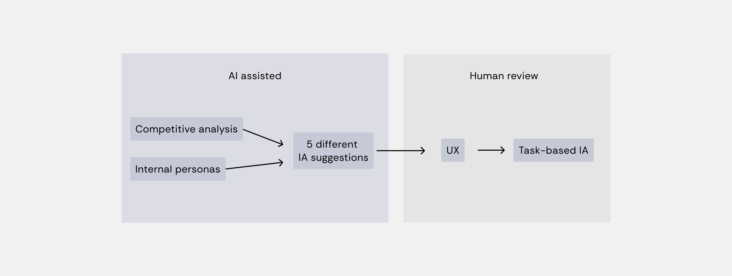
5 different IA suggestions
- Product based
- Life-cycle based
- Task based
- Audience based
- Use-case based
From those variants, the decision came back to design. After reviewing the options, a task-led model was the strongest fit. Developers navigate by what they are trying to do, not just what they are looking for.
The task-based information architecture map.
Our research team then ran quick tree testing with both existing and new VDP users to validate that direction before bringing it to product partners. That validation mattered, because product partners were initially hesitant to move forward. Restructuring the IA was a significant lift, and the instinct was to keep the existing structure rather than take on that scope. Having data in hand, rather than just a recommendation, was what ultimately helped make the case and move the conversation forward.
Process
02 - Updated navigation pattern
VDP hosts over 50 products, creating a level of complexity other competitor platforms don't have to design around. While several competitors relied on simpler navigation models, like a single horizontal nav, that approach didn’t scale for VDP’s breadth of products without overwhelming or oversimplifying the experience. I explored multiple layouts, including horizontal, left vertical, and dropdown menus.
Navigation explorations: horizontal, vertical and dropdown layouts.
I ultimately landed on a megamenu structure. This gave us room to scale as new products are added while still surfacing the platform's full complexity in a way developers could scan and parse quickly.
The final megamenu navigation.
Process
03 - Elevating Documentation and API Reference
Despite being the two things developers sought out most, Documentation and API Reference were buried inside a single, generic Products page.
Annotations on why Documentation and API Reference needed their own top-level pages.
I introduced Documentation and API Reference as their own top-level parent pages, each with dedicated vertical navigation, making them easier to locate and browse independently from product-specific content.
Alongside UX fixes, I also explored a new visual identity for VDP.
Rather than designing a new system from scratch, I used Visa's existing design system as a foundation and modified its core variables to better reflect a modern, developer-centric brand identity. I focused on adjusting the base component variables — spacing, radius, and surface treatment — to shift the overall feel of the interface. For example, padding was increased to give components more breathing room, creating a cleaner, less dense layout that felt more aligned with modern developer tools. By working within the existing system rather than replacing it outright, I was able to maintain brand consistency with the broader Visa ecosystem while still carving out a distinct visual identity.
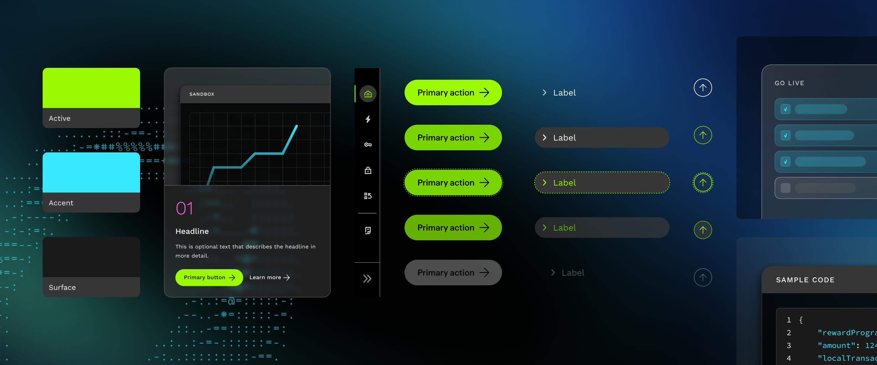
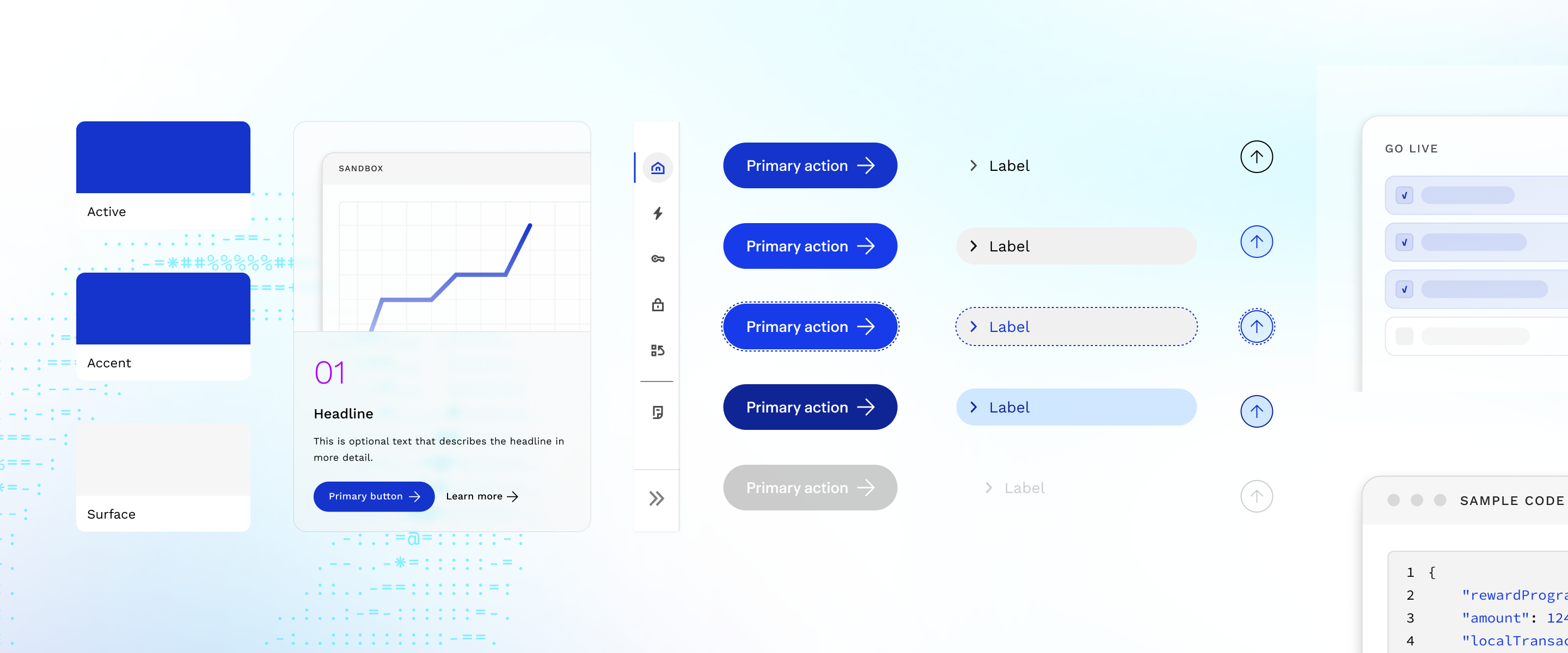
The visual identity in dark mode, then light mode.
Using Claude Code for design-to-dev handoff
To make abstract interaction details easier for developers to implement accurately, I used Claude Code to bridge the gap between static Figma designs and functional front-end code. For skeleton loading states, I first defined the core patterns in Figma, establishing how text blocks, images, and navigation elements should each appear in a loading state. From there, I used Claude to bring those static patterns to life, animating the shimmer effect so developers could see exactly how the loading motion should look and feel, rather than interpreting it from clunky Figma interactions. I then had Claude export the animations as a CSS file, giving developers a ready-to-implement asset they could pull directly into the codebase instead of rebuilding the effect from scratch.
Default text
Small text
Buttons
Loading → loaded
I used this same approach for other nuanced style details, like transparency and gradient treatments, where subtle implementation differences can significantly change how "on-brand" the final result feels. By handing off working code alongside design specs, I was able to reduce ambiguity in the build process and keep the final implementation closer to the original design intent.
Outcome 01
A brand new visual identity, with dark and light mode
Outcome 02
Restructured navigation with megamenu pattern. Task-based IA reflects developer mental models, not internal Visa ones.
Outcome 03
Docs and API reference are elevated with their own landing pages so developers can find what they use most quickly
Success metrics
of participants explicitly found the new task-led navigation more intuitive, with 72% giving it a high ease-of-use (SEQ) rating.
reduction in navigation errors and cut average task completion time by 50 seconds.
Most associated words with the redesign through user interviews. Successfully aligns with brand goal.
The redesign is launched. Check it out at developer.visa.com.
Project takeaway
Let data do the advocating.
Product was hesitant to go beyond a visual facelift, so we used survey results and quick user pressure tests to demonstrate the depth of the problem. The data helped expand our scope to address root usability issues.
Smaller working groups move faster.
Too many stakeholders in the room slowed decision-making, so we broke into smaller working groups with clear ownership, which let us move faster and make more decisive calls.
Feedback
Tracy, thank you for being such an amazing partner on VDP. I especially appreciate how you take the time to talk through ideas, consider different perspectives, and teach me how to do things myself rather than simply providing an answer. Your expertise, generosity, and collaborative approach make every project better, and I look forward to partnering with you again on VDP and future projects. Judith Nugent, Content Design Director
Your meticulous Figma designs and comprehensive style guides were instrumental. You consistently went above and beyond, accommodating every request and enabling us all to succeed in making this redesign truly outstanding. Thank you for championing our collective effort. Vivek Maganti, Senior Software Engineer