Scaling Visa’s Design System for public launch
This project was an effort to unify design and code into a single source of truth, while also making Visa Product Design System (VPDS) public to help partners and the broader payments community get started faster. I helped by building the system’s templates, interactions, and visual identity.
Problem
How might we unify VPDS's scattered design and code resources into one accessible home for both designers and developers?
VPDS had grown across multiple disconnected sources. Design documentation lived in 9 different Figma files while developer code examples were hosted across 4 different sites. The result was a system that existed, but had no single home. Designers and developers each had to navigate different tools, files, and sites just to find the guidance they needed.
Process
01 - Giving the system structure
The first challenge was scale. With dozens of components and guidelines to document, we needed a system that could be authored quickly and consistently, without every page being built from scratch. I helped define a component guideline template. I started by standardizing padding between headers and sections, and establishing a repeatable pattern for do's and don'ts guidance across every component page. This meant any new page could follow the same structure, cutting down on inconsistency and design decisions that had previously been made page-by-page.
The spacing scale, and how it shapes the component guideline template.
Once the template was defined, I partnered with engineering to break each content section into its own reusable component in code, rather than static, one-off pages. I went hands-on in VS Code to help author content directly from Figma into HTML, using Git to manage and ship changes.
Process
02 - Adding interactions to the icons library
Previously, icons lived on a separate, one-off site disconnected from the rest of VPDS. The landing page was a long, text-heavy explainer covering code languages and SVG basics, with the actual interactive lookup buried on a secondary page. Because this is a developer-heavy section of the site, I set up calls with engineers to understand what is actions are important for them to have and any friction they'd experienced with the old site.
Notes from my calls with engineers about what the icons library needed.
I redesigned this experience to live natively within the new public site, making the available actions for each icon — copy HTML, copy SVG, download — immediately clear rather than requiring developers to dig for them. I also introduced multi-select, letting developers batch-select and export multiple icons at once instead of repeating the process one icon at a time.
Walkthrough of the redesigned icons library: multi-select, per-icon actions and copy.
Process
03 - Visual polish
Before this, VPDS had no illustrative style at all, making it difficult to skim and distinguish components at a glance. I designed a new thumbnail style, using real components as the basis, but abstracted them by stripping out text and replacing it with skeleton-like visuals that hinted at each component's structure without rendering actual content. This gave every page a distinct, at-a-glance identity, making the system easier to scan and navigate across dozens of components and guidelines. This became the visual standard applied across all pages going forward.
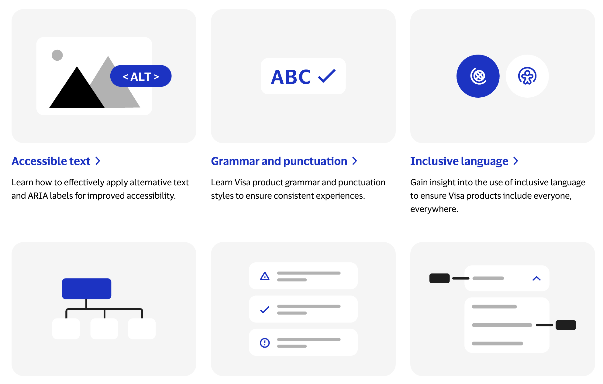
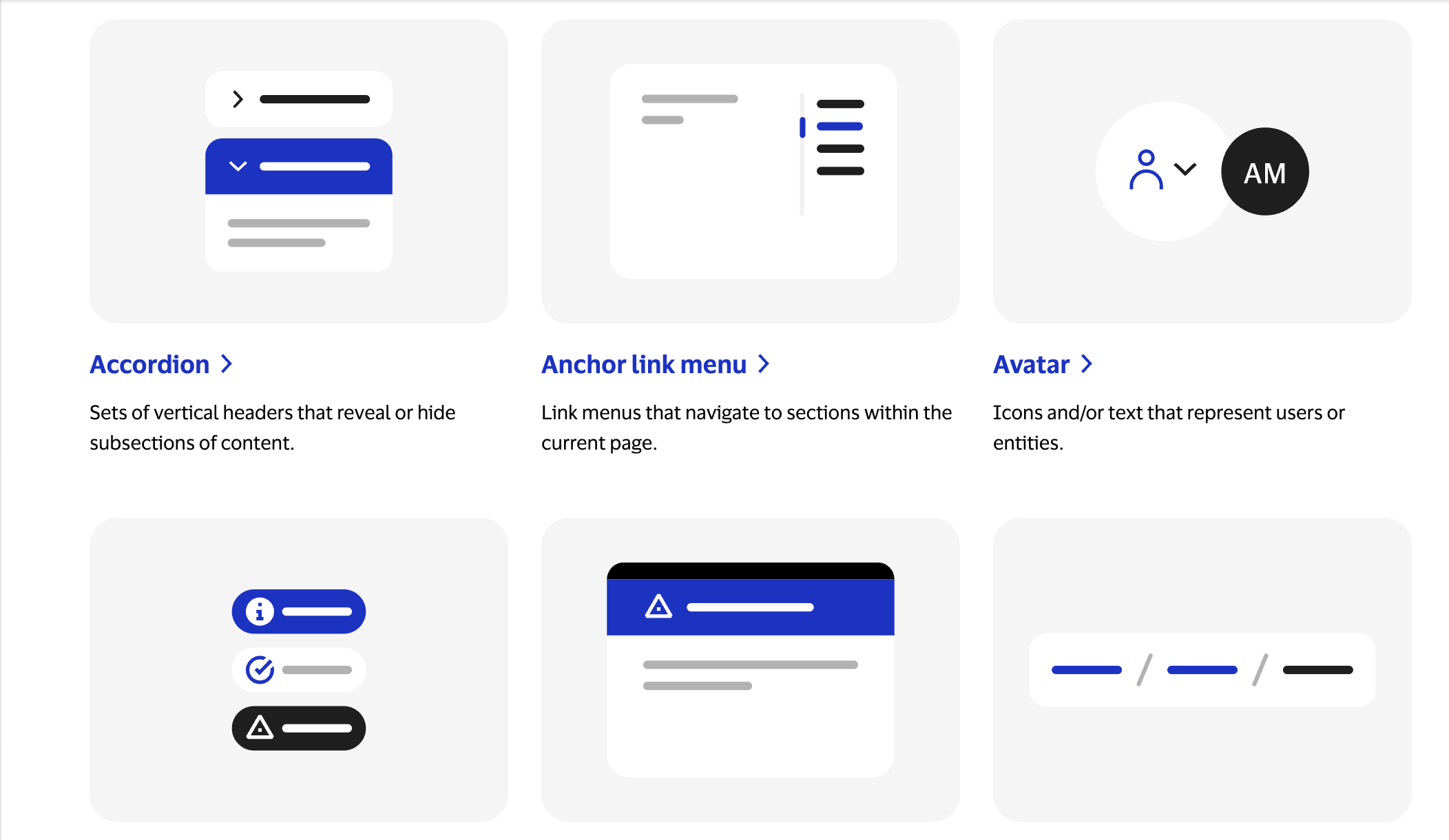
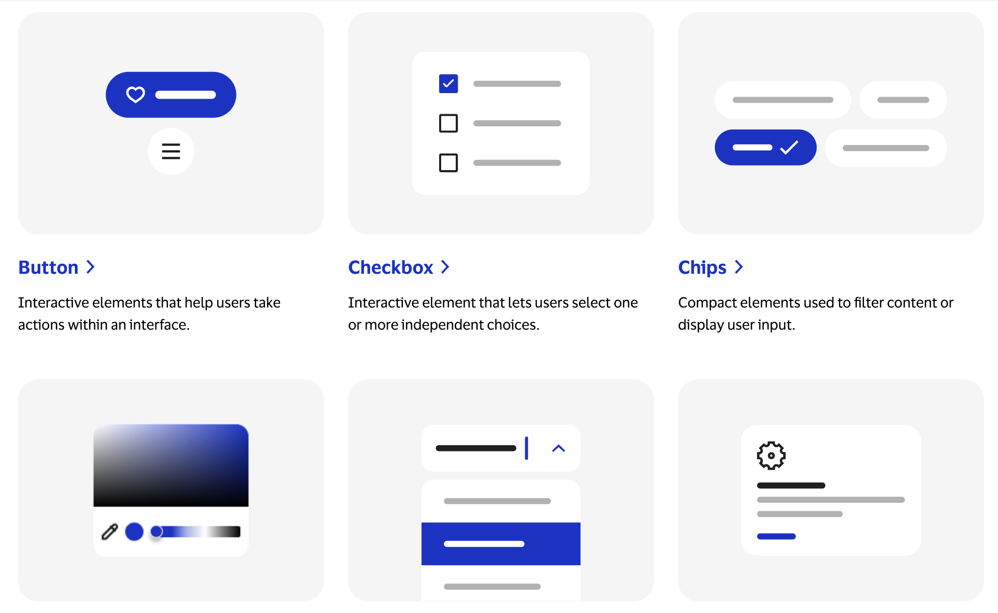
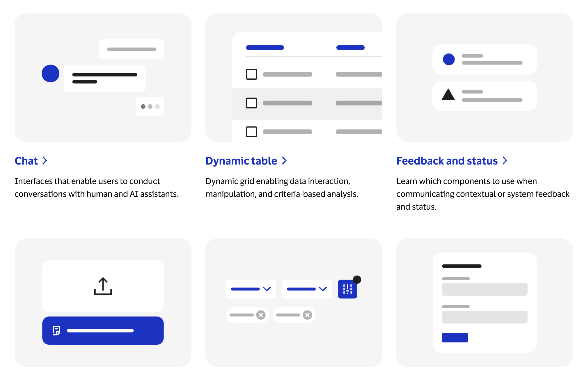
The component thumbnails I designed for the system.
Key results
Reduced 5 Figma files + 4 code libraries into a single source of truth
guidance pages authored in HTML
active users since public launch
Up from 63
components and patterns launched, fully accessible
The full system is live and publicly accessible. You can explore it at design.visa.com. :-)
Project takeaway
Design beyond my own perspective
As a designer in design systems, I think in atomic elements like buttons, icons, and text styles. But authoring in HTML pushed that thinking a level higher. I started seeing entire template sections, like a do's and don'ts block, as their own reusable components, not just the atomic pieces within them. Reasoning through decisions like this with my engineer gave me a better sense of how developers think about structure and reusability. This made our collaboration much smoother going forward, since I could speak more directly to how something should be built, not just how it should look.
Feedback
Tracy, thank you for changing and editing SO many files so fast for the Home Experience site. I am not going to count, but it is upwards of 100 files. You are doing this quickly and collaborating with developers and content experts. What is particularly praiseworthy is that you are working with git, branches, and merging, which is really outside of your normal role. Working with git can be EXTREMELY frustrating for any beginner and is tricky for experienced developers. Major kudos for your patience, teamwork, and diving in to do what has to be done! Miriam Salzer, Senior Design Engineer