Establishing patterns for Visa Design System
When I joined, Visa was migrating from an outdated, Sketch-based design system to Nova, a system built in Figma. While Nova had strong coverage for atomic components, we were still missing standardizations for complex, multi-step interactions. I architected a scalable, modular pattern that balanced design consistency with technical flexibility to fill that gap. This case study is a deep dive into the wizard pattern.
Problem
How might we evolve wizard guidelines to better support teams, and use that work as a model for future patterns in Nova?
Visually, the old wizard didn’t match Nova’s new direction, and functionally, it only covered a narrow set of use cases. This led teams to build custom, off-system solutions which resulted in inconsistent user experiences, duplicated engineering effort, and accessibility gaps. Underneath that sat a bigger gap. Nova had strong components, but no definition of a pattern, so there was no agreed way to document something larger than a single component.
Research
I used 3 methods to understand what teams needed, where they had diverged, and what had gone wrong before.
- Audit of ~8 product implementations. I catalogued what use cases each wizard served and what functionality teams needed, then mapped the findings in FigJam to spot where teams had diverged.
- Designer interviews. I followed up with calls where designers walked me through why they chose a pattern and what felt missing.
- Kickoff with senior stakeholders. Lead engineers, senior designers, and content designers who had worked on the previous wizard shared what worked, what didn’t, and what they wished they’d done differently. I sorted their questions into definition, functionality, and visual design.
Audit findings grouped in FigJam: inconsistencies, gaps and considerations, and wants.
Research
What I learned
Teams diverged on wizard behavior. One size wouldn’t fit. Teams needed wizards for long complex forms and constrained mobile screens. The open question was structural. The biggest question from kickoff was whether the wizard was a component or a pattern.
Kickoff notes: stakeholder questions sorted into definition, functionality and visual design.
Process
Decision 01 - Should the guidance explain how a wizard works, or help teams choose the right one?
My first draft gave each layout a numbered walkthrough: fill in the fields, select Next, repeat, submit. The steps were nearly identical across layouts, and the criteria for choosing between them were buried in the text. Reviews with senior designers and engineers revealed that users already know how to move through a wizard. What they lacked was a way to choose the right one, so each team drew its own line between layouts. I rebuilt the guidance around a usage table that compares the three layouts side by side, with clear criteria for when to use each and when not to. A page of repeated instructions became a decision users could make in seconds.
Before: every layout repeated the same walkthrough of basic wizard behavior
After: a usage table comparing layouts, with clear criteria for when to use each and when not to.
Process
Decision 02 - I introduced task flows to show the behavior instead of describing it
The audit showed teams diverged most on logic: what happens when a step depends on an earlier answer, or when a user goes back and edits a response. To address this, I separated wizards into two types: fixed, where every user follows the same steps, and branching, where steps change based on user input. My first approach was to explain the difference in writing. But branching logic is about cause and effect over time, and written rules alone was hard to convey implementation. So I introduced task flows: interactive prototypes that walk through real scenarios for each type, showing exactly what happens when a user moves forward, goes back, or changes an answer that adds or removes a step. Each layout in the guidelines links to its task flow, and engineering and accessibility reviewed every flow before build. Instead of interpreting rules, teams could see the logic working and match it.
Before: behavior rules described in written guidelines
After: interactive task flows that show how fixed and branching wizards respond
Process
Decision 03 - What should a pattern include, and how should it be documented?
The biggest open question from kickoff was whether the wizard was a component or a pattern. Nova had no definition of a pattern, and the wizard was one of the first complex interactions in the system, so my answer would set the precedent for every pattern after it. I defined a pattern as a reusable flow built from components. Since it was made of components, I wrote separate guidelines for its component parts and for how the pattern fits into a larger flow. That produced three long guidelines and a lot of unnecessary complexity.
Three long guidelines condensed into two: the wizard pattern and its task flows.
In a review session, I realized that users don’t care what a pattern is made of; they want to know how to use it. With three documents, they first had to work out which one to open. I redefined a pattern as components, layout guidance, and behavior rules that work together to solve a task, and condensed the documentation into two guidelines: the wizard pattern and its task flows, ordered by what a user needs first. That structure became the template for later patterns, starting with file upload.
Outcome 01
Clear definition on when to use wizard variants
Outcome 02
Show, don’t tell. Interactive task flows show users how each wizard logic works.
Outcome 03
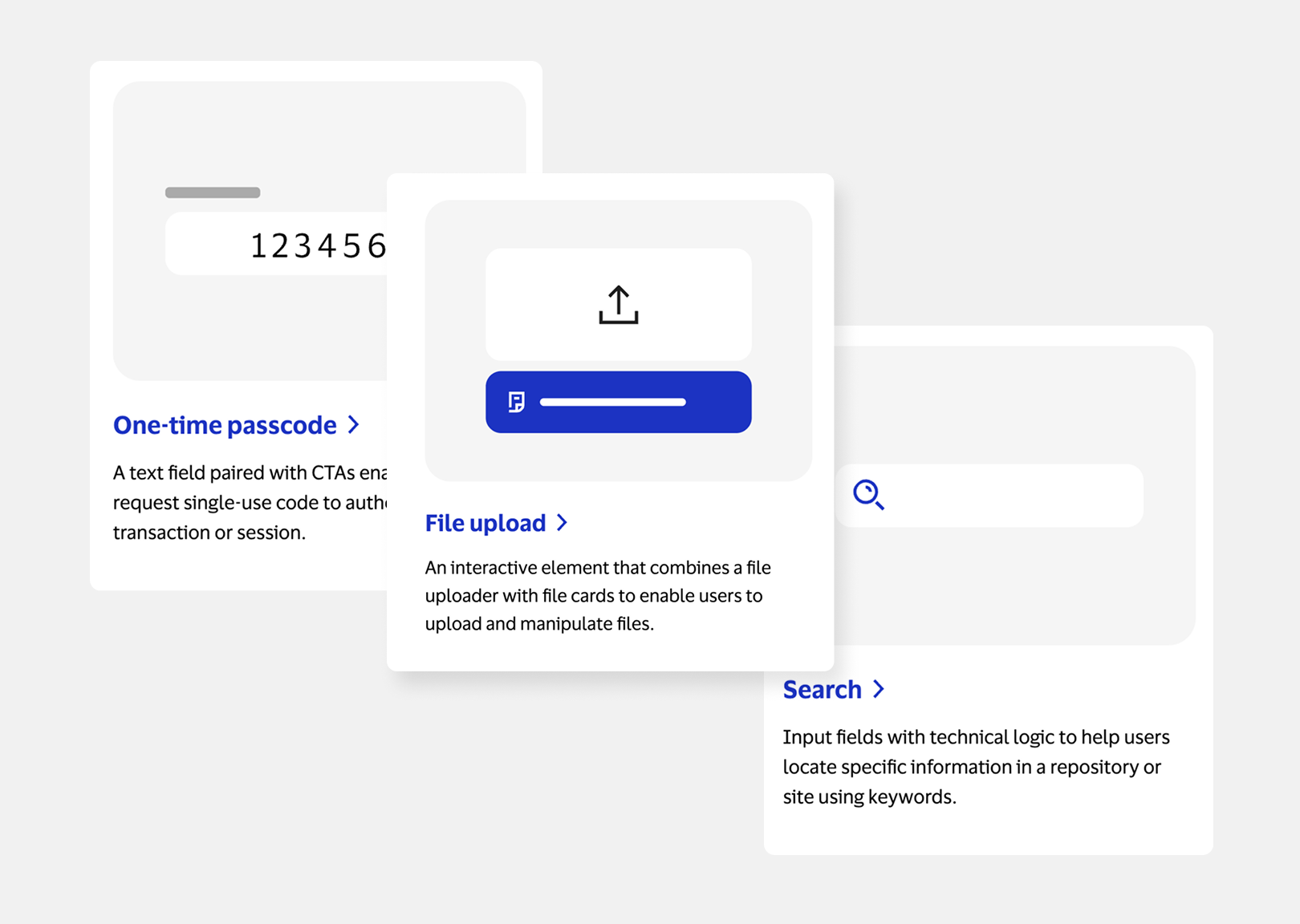
A reusable pattern for future Nova additions
Key results
adopted new wizard pattern
new pattern guidelines modeled after this one
Project takeaway
Balance guidance with flexibility
In the beginning, I had trouble scoping the work and often went into rabbit holes for one-off scenarios. Working on this project I learned that as a design system, our goal isn’t to solve every edge case; it’s to provide clear guidance for the most common use cases without becoming overly prescriptive.
Feedback
Want to give Meghan and Tracy a standing ovation for their work on wizard. This component/pattern/flow has been notoriously difficult to complete but y’all nailed it! You both truly demonstrate how content and design should collaborate as one team to execute with excellence. Here’s to this dynamic duo who made intricate look effortless. Brandee Dudenhoefer, Content Design Lead